A Look at Midcentury Modern Vintage Posters Advertising NYC
In viewing mid-century modern posters depicting New York City, it is a curious surprise to find a direct graphic line drawn between 1947 and 1956, as four of the most prominent (and spectacular) of these posters display a visual connection that is incontrovertible. Although almost never seen side by side, these four posters allow us to watch, almost in real-time, as design ideas are synthesized and developed, where new concepts are built on the backs of existing designs and previous elements are expanded upon and improved.
Eric Nitsche
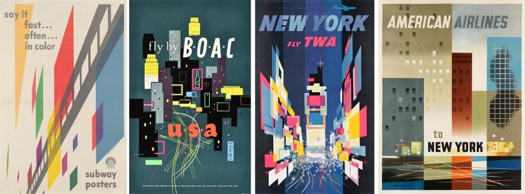
Left: Eric Nitsche, Say It Fast… Often… In Color / Subway Posters, 1947. Sold May 2003 for $3,450.
In 1947, the New York Subway Association commissioned the most prominent and highly regarded graphic designers living in America to launch a vast, multi-visual campaign to help glorify the efficiency of advertising in the subway. Among them were Herbert Bayer, Lester Beall, Joseph Binder, Jean Carlu, McKnight Kauffer, Eric Nitsche, Paul Rand and Otis Shepard. For Nietsche’s modernist, almost futurist, poster, he uses a strong diagonal perspective, creating a semi-abstract vision of a subway whizzing past colorful posters, creating a sophisticated, geometric rhythm.
Nitsche studied in Switzerland and then worked in Paris before he moved to America in 1934. One of many young European immigrants who changed the face of American graphic design, Nitsche is best remembered for his series of 29 posters for General Dynamics, where he served as Art Director between 1955 and 1960.
Richard Negus & Philip Sharland
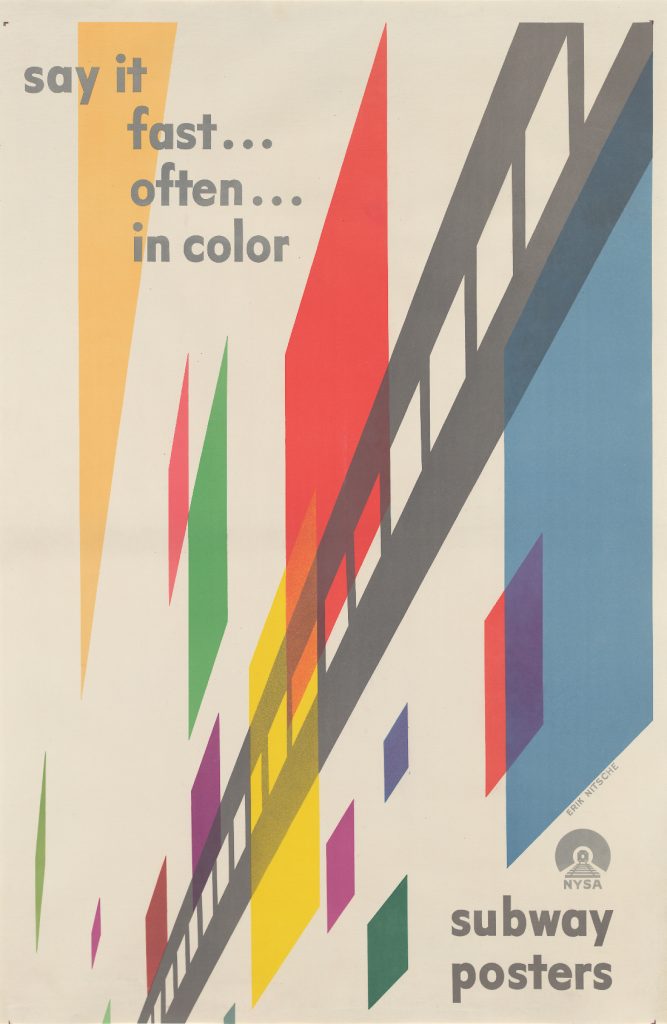
Right: Dick Negus & Philip Sharland, Fly by BOAC / USA, 1954. At auction September 26. Estimate $2,500 to $3,500.
Richard Negus and Philip Sharland were a British design team who rose to fame based on their 1954 Day-Glo-colored poster campaign for BOAC. Throughout their design career, they went on to design posters for Aer Lingus, the Orient Line, and the General Post Office, for whom they also designed stamps and aerogrammes (including an unrealized design for a stamp commemorating the 50th anniversary of the first flight of the Concorde).
Their 1954 series consisted of six separate destinations, including the Caribbean, Middle East, Far East, Africa, Great Britain, and the USA. Of the others, one, for Great Britain, also plays on this theme of a big city by night with an exciting view of Piccadilly Circus with its traffic and lights and energy.
For the USA, they designed an image that can surely be seen “as a precursor to David Klein’s poster for TWA showing Times Square, this composition, filled with abstract representations of buildings, lights, neon signs, and rapidly flowing traffic, is the first to apply rudimentary Atomic Era design principles to an advertisement for travel to America.” (New York p. 165) Tackling what they believed Times Square looked like, they did a wonderful job capturing the jumble of lights, sounds, and activity, made to pop with their use of Day-Glo colors. And you really get the feel of what it is like to be in the heart of Manhattan.
David Klein
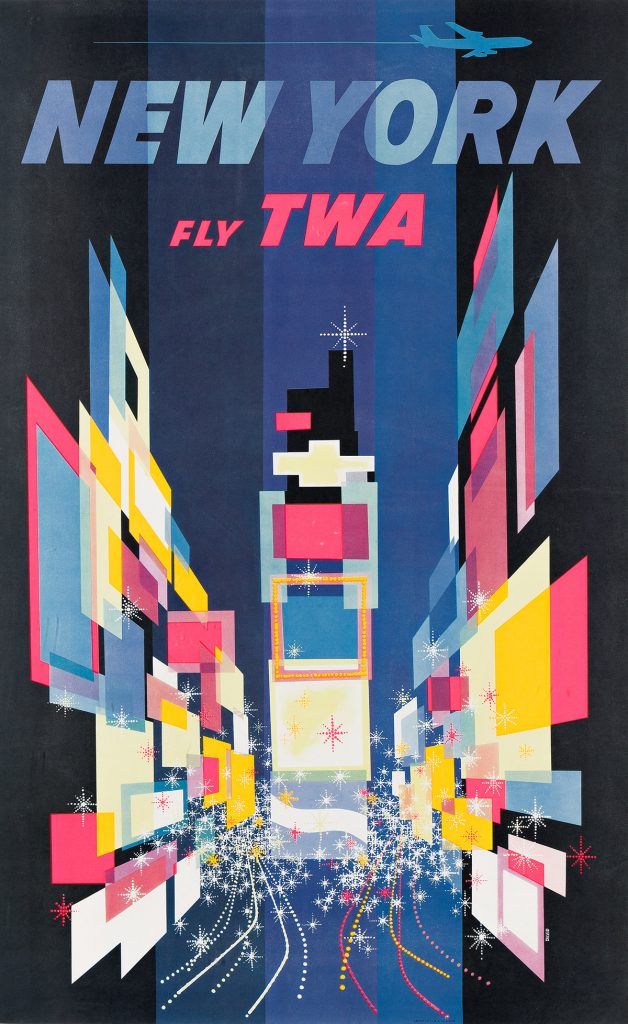
Left: David Klein, New York Fly TWA, circa 1960. At auction September 26. Estimate $6,000 to $9,000.
Perhaps the single best-known and most highly regarded mid-century modern design image for New York City is by David Klein. He took the exceptional visual ideas presented a few years earlier by Negus and Sharland and ran with them as far as he could. It is a “kaleidoscopic, abstract view of Times Square looking north toward 47th Street. With his beautiful use of colorful geometry, Klein deftly evokes the billboards, lights, traffic, energy, and excitement of the area” (New York p. 167). He distills Times Square down to its primary features, which are squares of light, the taillights of the cars that are driving through, and the sparkle of the neon that is all around. In terms of synesthesia, Klein is able to capture the image in such a way that the viewer can practically hear the colors and see the sounds of this magnificent cross street in mid-town.
Klein, though best known for his bright and bold travel posters of the 1950s and 60s designed for TWA, also designed numerous theatrical posters for Broadway shows in the late 1940s. He went on to design for Amtrak, Orbitz, Holland America Cruises, First National Bank, and many others.
Related Reading:
Weimer Pursell
The same year that Klein designed his masterpiece for TWA, Weimer Pursell designed a poster for American Airlines that incorporated “many of the same conceits as David Klein’s TWA poster” (New York p. 187). It is very interesting to consider which of these two images came first.
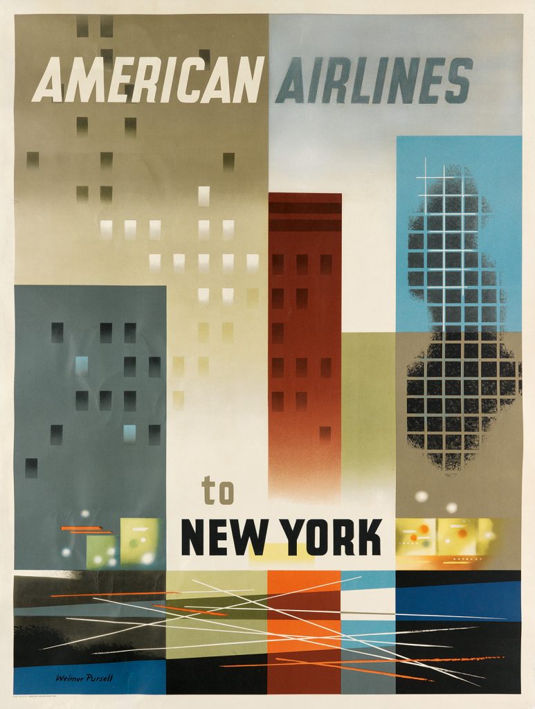
Here, abstracted skyscrapers, shop windows, traffic-filled streets and the hustle-and-bustle of New York City life are all represented in a high energy street scene – exemplary of classic American graphic Modernism.
Born in Tennessee, Pursell had no artistic training until the late 1920s when he moved to Chicago and enrolled at the city’s prestigious Art Institute. He financed the completion of his studies through his work as a package designer and billboard artist. His successful career as a freelance illustrator in many of the most prestigious American magazines (Life, Redbook, Town & Country, Fortune, Forbes and Newsweek). He also designed posters for some of the country’s largest companies, including American Airlines, Winchester Rifles, Coca-Cola, and for the 1933 Chicago World’s Fairs, as well as propaganda posters (most memorably, When You Ride Alone You Ride with Hitler!).


![Grace Meschery-McCormack shares about two copies of Fernando de Rojas’s ‘La Célestine,’ including a limited edition copy illustrated by Pablo Picasso.
At auction April 22. Learn more about the works at the link in our bio.
#Rarebooks #rarebookdealer #antiquarianbooks #auctions
_______________________________________
Music Credit:
Schubert - Piano Quintet in A major ‘The Trout’, D. 667 - IV. Andantino – Allegretto
Music provided by Classical Music Copyright Free on Youtube [https://tinyurl.com/visit-cmcf]
Watch: • Schubert - Piano Quintet in A major ‘...]](https://scontent-iad3-1.cdninstagram.com/v/t51.75761-15/491443494_18499096345036585_5935932878956098058_n.jpg?stp=dst-jpg_e35_tt6&_nc_cat=107&ccb=7-5&_nc_sid=18de74&_nc_ohc=QlZg0o3Vx4oQ7kNvwHlPDYS&_nc_oc=Admkx5CH3-5gNl9kFtE07uGBWzC1TrU8LutoXTk30m77fiWC0m2_oIjIUSQBbJE8mA8&_nc_zt=23&_nc_ht=scontent-iad3-1.cdninstagram.com&edm=AM6HXa8EAAAA&_nc_gid=ju2TRmN0KnKsf4JlFcpEDg&oh=00_AfKzdMkc_2wbmUBq_fezsk6a6rJsAdbvq5YETq9Dcmf5yQ&oe=6826C451)

