Artist Profile: Edward McKnight Kauffer
To look at the graphic design work of Edward McKnight Kauffer is to experience a master craftsman helping to propel modernism into the mainstream. He achieved the height of his creativity in the decades after World War I, bringing his creative, modern aesthetic to a fast-paced world that was eager to embrace his exciting new visual creations.
The London Transport Museum posits that “Edward McKnight Kauffer was undoubtedly one of the most prolific and influential graphic designers of the 20th century. Cubism, [Vorticisim, Art Deco,] Futurism and Surrealism found expression in his posters, which translated the complicated language of the avant-garde into accessible commercial design” (www.ltmcolection.org).
Kauffer was deftly able to weave fine art concepts into instantly agreeable and visually digestible forms. He bridged the gap between the refined, aloof world of art exhibitions and what the public would see every day as they went about their daily lives, successfully bringing art into the streets for the masses to enjoy. Enticing and pleasing even those who never thought they would enjoy stepping into an art gallery.
Anthony Blunt, reviewing a show of Kauffer’s work in 1935 notes the following: “Apart from producing admirable posters, Mr. Kauffer has rendered another important service to modern art. By using the methods of more advanced schools and by putting them before the men in the street in such a way as to catch them off their guard, so that they are lured into liking the poster before they realize that it is just the kind of thing which they loath in the exhibition gallery, by this means he has familiarized a very wide public with the conventions of modern painting.” (Haworth-Booth p. 70).
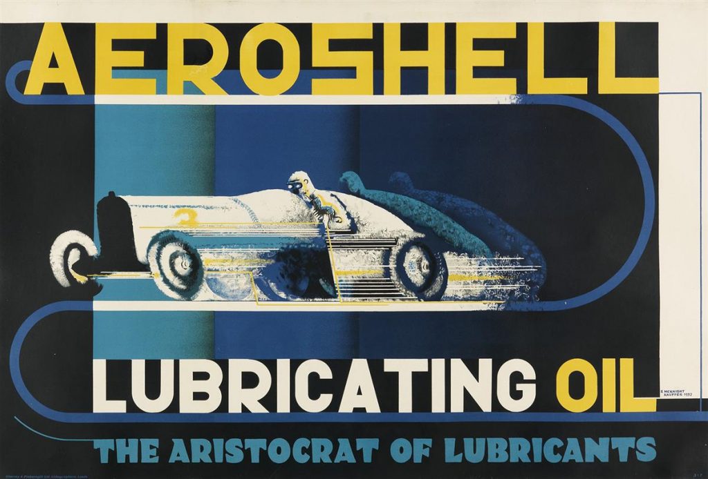
Early Life & Career
Born in Montana, to a poor family, Edward (Ted) Kauffer grew up in Evansville, Indiana, where he spent two years in an orphanage as his father had left and his mother sought employment. His precocious artistic talent led him to join a traveling theatre company as a set painter at age 12 or 13. His youthful journey then found him employed in a bookstore in San Francsico, a sojourn at the Art Institute in Chicago, sponsorship to study in Europe (from a man named Joseph E. McKnight, whose name Kauffer took in tribute and as thanks) followed by brief studies in Munich and then arriving in Paris in 1913. The following year, with the outbreak of World War I, Kauffer left Paris and settled in England.
Kauffer’s first commission came from the legendary Frank Pick in 1915. Pick pioneered advertising in Britain. In his capacity as the publicity manager for the Underground Electric Railways Company of London (the London Underground and Transport System), Pick served as a great artistic patron to the graphic arts. He commissioned hundreds of young designers to promote the subways and buses of London. Over the next 20 years, Kauffer designed 141 posters for the company, redesigned subway stations, installed murals, and more.
Commercial Success
On the strength of his design work Kauffer rapidly rose to prominence. Such was his fame that in addition to the London Underground he also worked for the Empire Marketing Board, the Post Office, Great Western Railway, Shell, BP, Imperial Airways, Eno’s Fruit Salt, W.A. Gilbey, and many others. One client, Eastman and Son, were very aware of the public’s thirst for new images by Kauffer and played to the anticipation of his latest designs by posting stickers reading “A New McKnight Kauffer Poster Will Appear Here Shortly” on empty sidings to mollify passersby who were eager to see his next creation.
The years between 1915 and 1940, when Kauffer was forced to return to America due to the outbreak of World War II, were the most creative of his career and he produced a prodigious output of posters which were among the best designs of their era.
In 1940 Kauffer returned to America where he did extensive design work for American Airlines, Pan American Airlines and the Museum of Modern Art
Between 1946 and 1953, he designed more than 30 posters for American Airlines; some were landscapes and illustrative images, while others were photomontages and Modernist designs. And while he was never quite grounded or content in the United States as he was in Great Britain, his work continued and he created posters for a plethora of important companies and organizations such as Stetson, the Office of Inter-American Affairs, the New York Subways advertising company, the United Committee of South-Slavic Americans, the Chesapeake & Ohio Railway and Ringling Brothers and Barnum and Bailey circus.
Derry & Toms
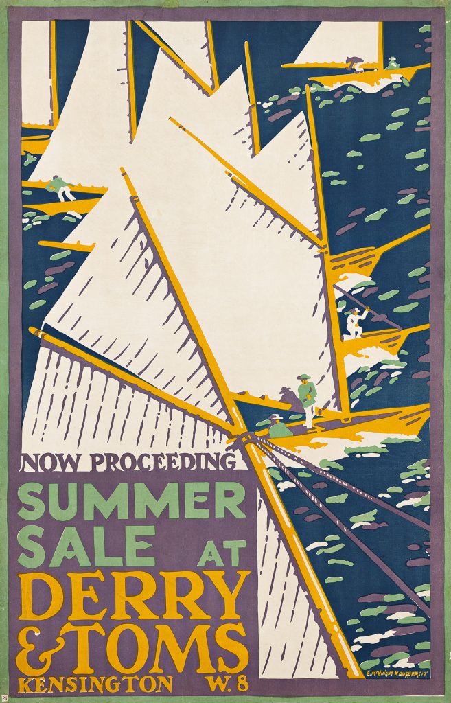
Left: Edward McKnight Kauffer, Summer Sale at Derry & Toms, 1919. At auction February 29, 2024. Estimate $4,000 to $6,000.
Kauffer designed five posters for the London Department store Derry & Toms. His first, from 1917, borrowed heavily from a design by Ludwig Hohlwein. Hohlwein’s influence can be seen here as well, in relation to the poster he designed in 1909 for a regatta on Munich’s Starnberger Lake.
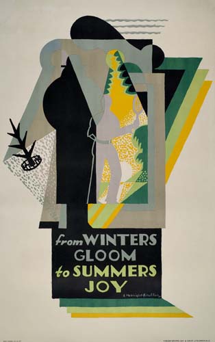
Right: Edward McKnight Kauffer, From Winters Gloom to Summers Joy, 1927. Sold May 2007 from $9,600.
This poster, a pure example of Kauffer’s genius, is an extraordinary composition that is both extremely sophisticated and perfectly readable. Mixing supple lines with Cubist forms and employing a warm, vibrating palette of colors, Kauffer displays his mastery of sensitive Art Deco. This is in direct contrast to A.M. Cassandre, who was the master of mechanization, with a cold, geometric approach to design. One of Frank Pick’s ideas was to give his artists complete graphic freedom in their work for the underground. That practice bears fruit here, with Kauffer not mentioning the Underground anywhere, not even incorporating its logo into the design. Curiously, he doesn’t even include the apostrophes in “Winter’s” and “Summer’s.”
Great Western Railway
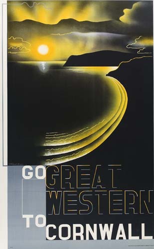
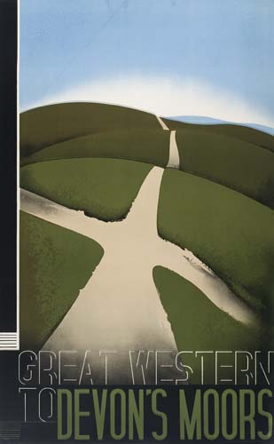
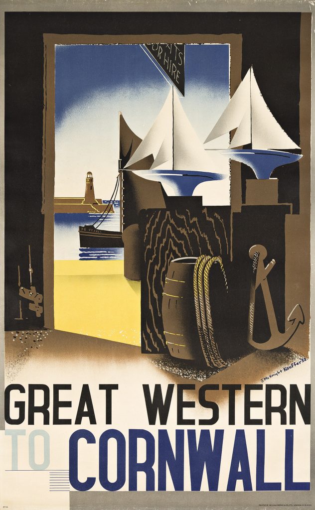
Kauffer designed six different posters for the Great Western Railway in 1933 promoting travel to Cornwall. One features ships and a lighthouse seen from the interior of a dock-side shack [a visual precursor to his late 1940s image for American Airlines advertising travel to New England]; the other is a landscape with a stone wall, trees, the ocean, and a sandy path. This is by far the most modern, daring and evocative. It is a multiple masterpiece, combining excellence in composition, typography, balance, airbrush and overall design. In another example from the GWR series, one can see his exceptional use of geometric patterns.
Gilbey’s
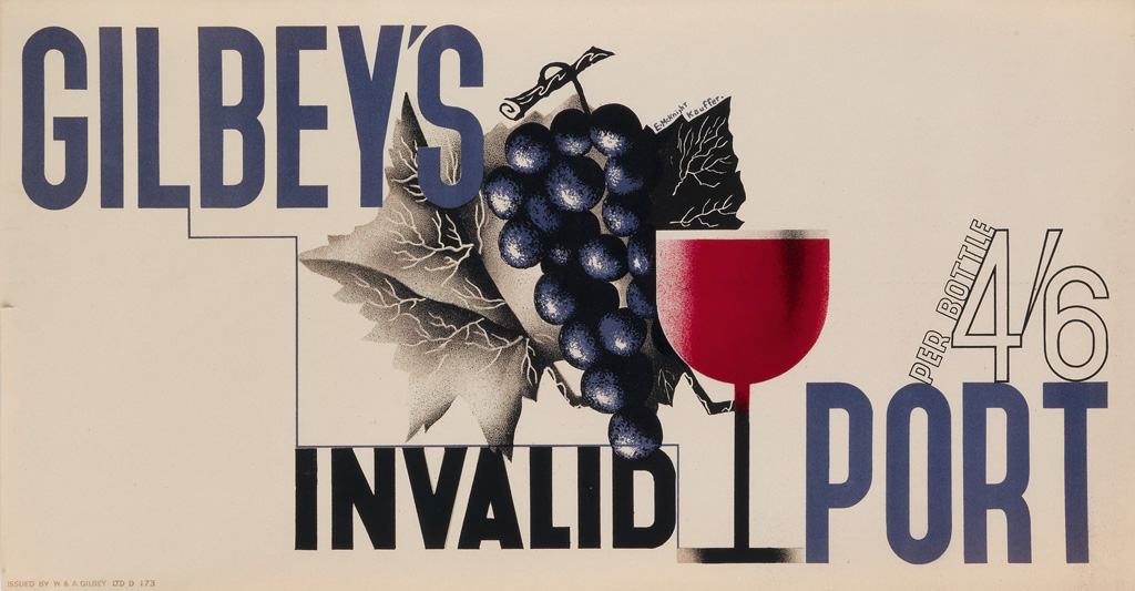
In 1933, Kauffer designed seven point-of-purchase posters for Gilbey’s, a wine and liquor distributor. All but one were in this horizontal format, each achieved using Kauffer’s innate graphic genius, and representing the pinnacle of Art Deco design in the commercial field. They combined exceptional typography and imagery, some leaning more heavily one way than the other.
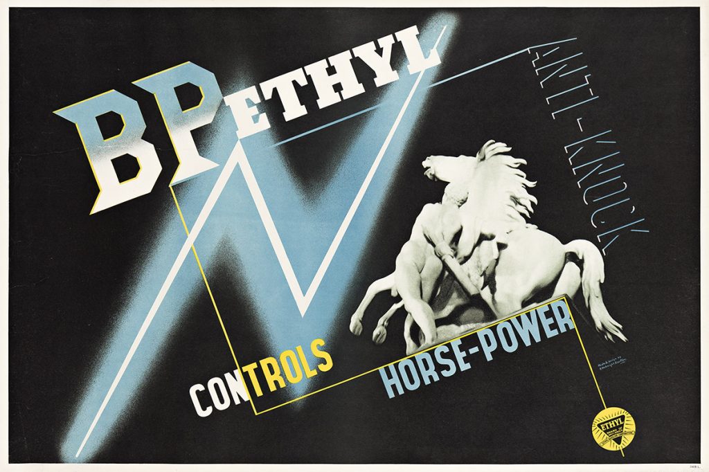
For this striking, symbolic, graphic allegory, Kauffer combines photography and typography, organizing the image around an inclined rectangle, delineated by the brand name and its described qualities, against a black background. An electric flash of lightning cuts the poster in half, symbolizing the power the fluid has on engines, while a photo integrated on the right shows a statue of a rearing horse to literally evoke the “horsepower.” The photograph, which Kauffer took himself, is of the Parisian statue Cheval Retenu par un Palefrenier [Horse Restrained by Groom], by Guillaume Coustou, more commonly known as the Marly Horses.
American Airlines
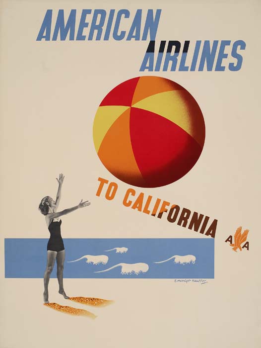
One of Kauffer’s last advertising campaigns was for American Airlines. “In 1947 he was discovered by Bernard Waldman, a young New York advertising man who wanted to bring the European poster tradition to America. He commissioned Kauffer to do a series for American Airlines” (Steven Heller, The Essential Modernist). This image, arguably the rarest of Kauffer’s America-era posters, is an elegantly simple combination of photomontage and typography. From the two-toned lettering, to the larger-than-life beach ball and the suggestion of waves and shadows in the sand, this image clearly reflects Kauffer’s avant-garde design sensibility, and is one of his finest designs from this period.
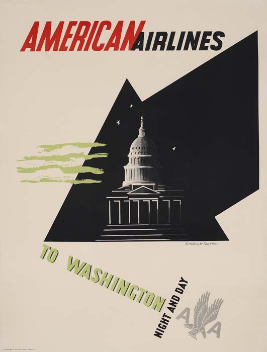
In 1948, Kauffer designed a poster for American Airlines travel to Washington D.C., which presented a straightforward view of the Capitol, beneath a starry sky, with red, white and blue typography. That popular, generic, image is readily available, as many copies have survived. The far more sophisticated design of this image suggests that it was designed earlier than 1948. Likely far too “European” (complex) for American sensibilities, it seems Kauffer was asked to design a different image for Washington which would be more accessible and comforting to the American public. Note here how the clouds evoke the stripes of the American flag.
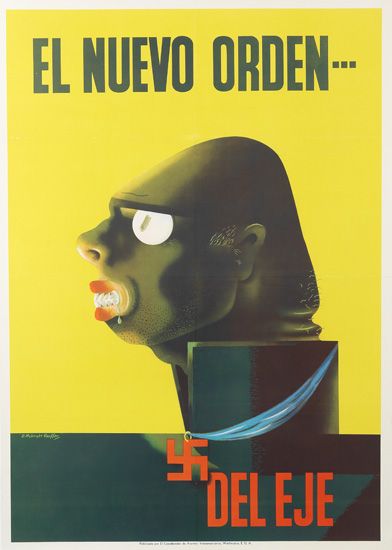
Left: Edward McKnight Kauffer, El Nuevo Orden, 1942. Sold August 2010 for $800.
An astonishing image that is absolutely unexpected within the scope of Kauffer’s work. In an attempt to vilify Germans during World War II, he has incarnated an Axis officer in the image of a horrifying, slobbering, wild beast. Created for the Asuntos Interamericanas, an organization which generated propaganda for dissemination in Latin America, Kauffer’s vision of the “New Order of the Axis” is on a par with Karl Koehler’s This is the Enemy (see Swann Poster Auction 2612 – Lot 115) as one of the most effective anti-enemy images ever penned in the United States.



![Grace Meschery-McCormack shares about two copies of Fernando de Rojas’s ‘La Célestine,’ including a limited edition copy illustrated by Pablo Picasso.
At auction April 22. Learn more about the works at the link in our bio.
#Rarebooks #rarebookdealer #antiquarianbooks #auctions
_______________________________________
Music Credit:
Schubert - Piano Quintet in A major ‘The Trout’, D. 667 - IV. Andantino – Allegretto
Music provided by Classical Music Copyright Free on Youtube [https://tinyurl.com/visit-cmcf]
Watch: • Schubert - Piano Quintet in A major ‘...]](https://scontent-iad3-1.cdninstagram.com/v/t51.75761-15/491443494_18499096345036585_5935932878956098058_n.jpg?stp=dst-jpg_e35_tt6&_nc_cat=107&ccb=1-7&_nc_sid=18de74&_nc_ohc=AZ-awqelOZgQ7kNvwFA19hE&_nc_oc=AdkZVODYB5VxTPck7kaEV8QTzHwvQLzaAjo_r9W39mgpTAk2Ix_Bp7bj2bTOpAdxWZY&_nc_zt=23&_nc_ht=scontent-iad3-1.cdninstagram.com&edm=AM6HXa8EAAAA&_nc_gid=R9A_jV_TBvtz3bvG-M6ucA&oh=00_AfEGxrg_YthDKOjz6rX1J1-RHXRRH_zFIOS_mEZWxYMkQg&oe=680F0951)


