Artist Profile: William Addison Dwiggins
William Addison Dwiggins was a multi-hyphenate artist: book designer, typographer, illustrator, writer, marionette maker. He rose to prominence through his advertising and publishing work in the 1920s, winning the Gold Medal from the American Institute of Graphic Arts in 1929, which solidified his place as an innovator in the field. Dwiggins explored his varied interests in design at his home in Hingham, Massachusetts, where he maintained a studio space complete with a marionette theater. Two long-term partnerships also defined Dwiggins’s career: one with Alfred Knopf, many of whose trade books Dwiggins designed, and another with the Mergenthaler Linotype Co., with whom Dwiggins introduced typefaces that are still popular today.
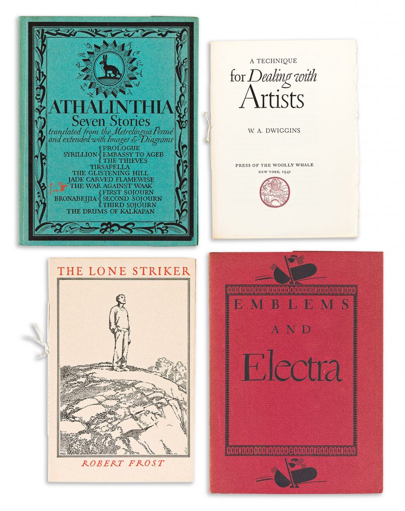
Twelve lots by Dwiggins in our Graphic Design sale on May 18, 2023, showcase Dwiggins’s varied work as a practitioner of—and creative commentator on—the graphic arts.
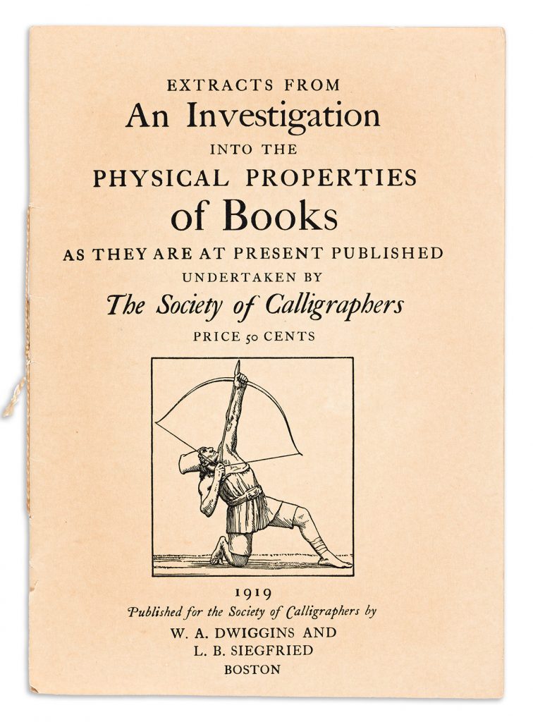
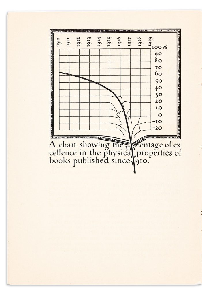
Born in Martinsville, Ohio, in 1880, Dwiggins studied under Frederic William Goudy at the Frank Holme School of Illustration in Chicago. Dwiggins followed Goudy to Hingham, Massachusetts, where he would remain for the rest of his career. Dwiggins established himself as a book designer in the 1920s and began work with Alfred Knopf, transforming their designs for trade books and setting a new standard for the industry. In his 1919 pamphlet An Investigation into the Physical Properties of Books, Dwiggins expresses his displeasure at the state of book publishing in a cheeky graph in which the line of book quality does not merely plummet, but breaks through the grids itself and jumbles the text below. Design, he seems to say, is a powerful tool that can as easily disrupt legibility as drive home a message.
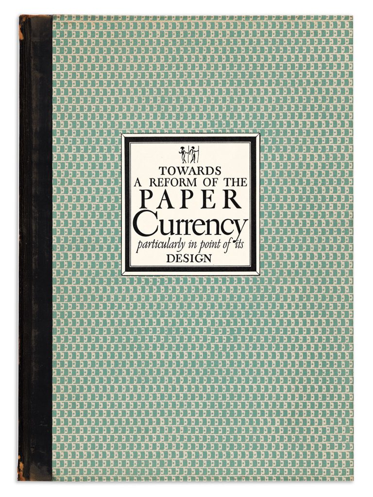
Dwiggins’s critiques extended beyond the world of books to encompass the ubiquitous issue of currency, which he does so in a characteristically playful manner. In Towards a Reform of the Paper Currency Dwiggins uses the fictional country of the Antipodes as his example of model currency design. Unlike the design of U.S. currency—which is “the last of a series of copies—copies of copies of copies of copies, along a weary sequence back to the Louis-Philippe original” (Reform, 12)—the currency of the Antipodes gives the impression of “a commonwealth that knows its way about. . .a government that gets things done with dispatch and efficiency and style” (Reform, 6). Dwiggins presents his ideas with a wink, as when he casts himself as the secretary to the fictional Society of Calligraphers to describe U.S. currency as “inscribed in such a fashion and distributed in such a way that every effort of the mind to grasp their significance is frustrated” (Reform, 16). Dwiggins even goes so far as to interleaf a sample of a five-crown bill from Antipodes towards the end of the book. But this is serious play.
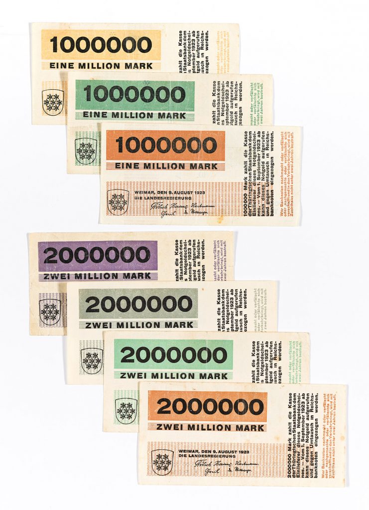
As Paul Shaw notes, the pared-down design Dwiggins recommends—exemplified in the ample white space, simplified typefaces, and minimal ornamentation of his sample bill—echoes Herbert Bayer’s approach to designing for exceptionally large denominations that were quickly issued amidst rampant inflation in Germany after WW I. Although he often couched his work in humorous fictions, Dwiggins was serious about the potential for design to streamline essential communication.
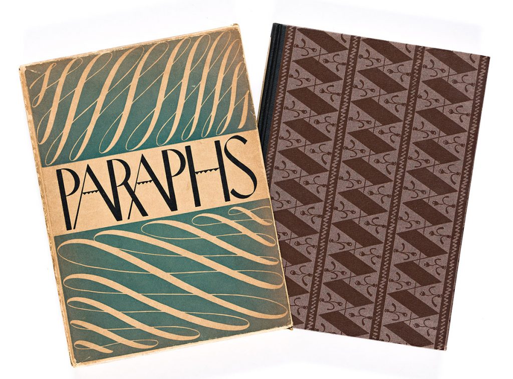
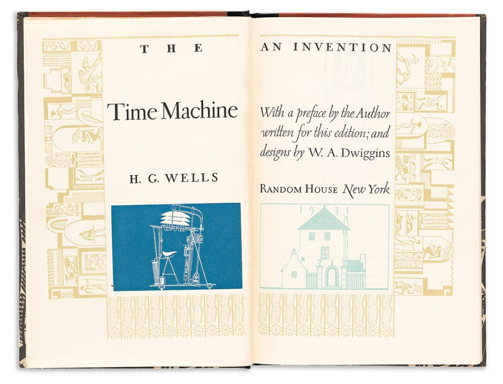
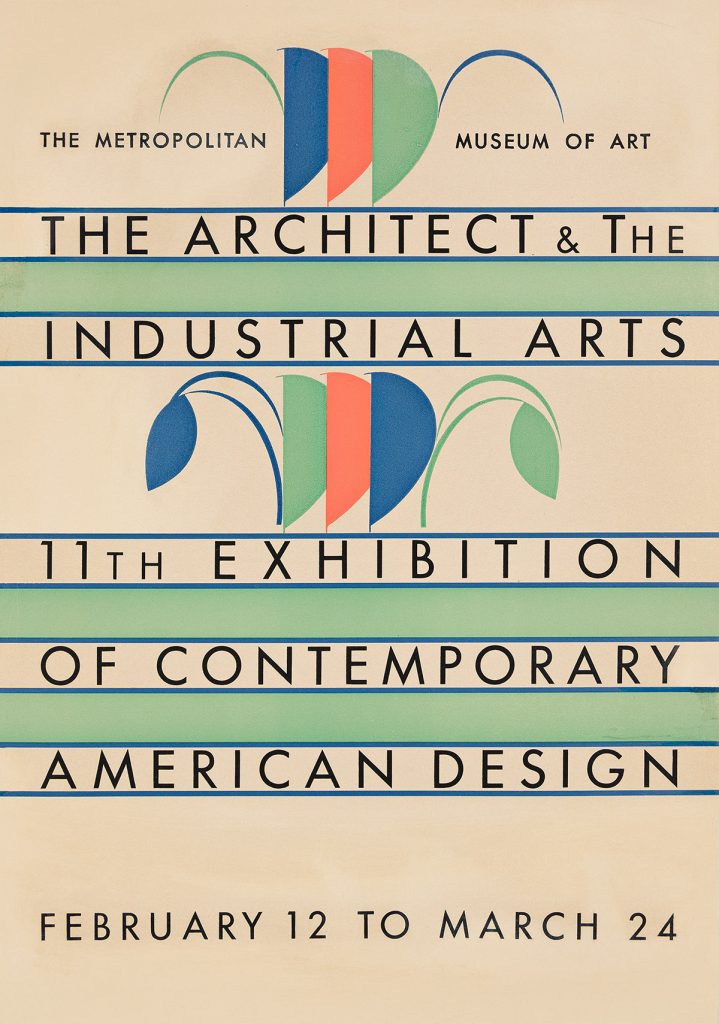
Dwiggins drew on all aspects of his work with layout, typography, illustration, and marionettes to develop his design philosophy. He saw successful typographic design, for instance, as a unity between text and ornament. He aimed to “plainly show that both came out of the same box: as though particular groups of words had been told off for special ornamental duty, and had blossomed at command into decorative units”. Indeed, many of Dwiggins’s designs in Paraphs—the first book of his own that Dwiggins published with Knopf—seem to be composed of errant elements, dots and dashes that might as easily arrange themselves into letters as into ornaments. Dwiggins frequently employed stencils, cutting out shapes from acetate, which he could then arrange and rearrange to create his designs. In both his cover design for The Time Machine and his poster for the 11th Exhibition of Contemporary American Design shapes rotate and reappear, recalling perhaps Dwiggins’s work making and manipulating marionettes.
In Marionette in Motion, Dwiggins describes his method of constructing marionettes, but he also made the connections between marionettes and typography explicit in his “M-Formula”—or “Marionette Formula” in 1937. Marionette faces with strong angles and flat planes, Dwiggins observed, were easier for the audience to see. He translated this lesson to type design and, as his biographer Bruce Kennett explains, “used his new M-Formula to improve the vitality and readability of the heavy letterforms required by newspaper printing. What appeared to be jarring when seen in a large size became smooth and coherent when read on newsprint at actual size.”
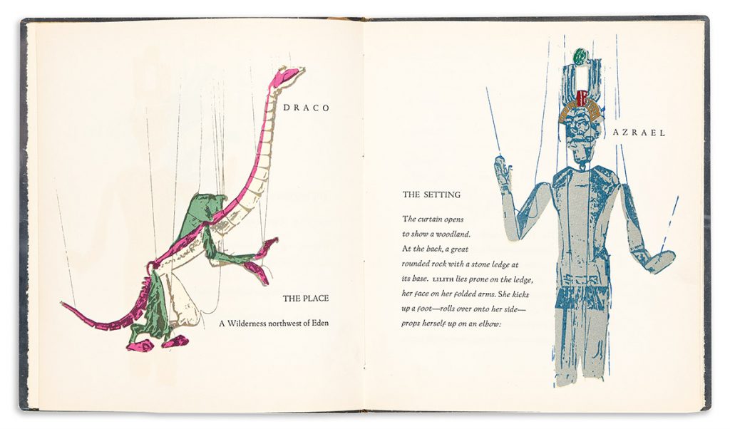
The cross-pollination between Dwiggins’s pursuits is perhaps best summed up in the printing of Prelude to Eden, a marionette play written and designed by Dwiggins at the end of his life. The illustrations were made by posing and photographing Dwiggins’s marionettes, with the photographs then being turned into silkscreens for reproduction in the book. From carved face to printed image, the colorful illustrations bring Dwiggins’s playful creativity full circle.




![Grace Meschery-McCormack shares about two copies of Fernando de Rojas’s ‘La Célestine,’ including a limited edition copy illustrated by Pablo Picasso.
At auction April 22. Learn more about the works at the link in our bio.
#Rarebooks #rarebookdealer #antiquarianbooks #auctions
_______________________________________
Music Credit:
Schubert - Piano Quintet in A major ‘The Trout’, D. 667 - IV. Andantino – Allegretto
Music provided by Classical Music Copyright Free on Youtube [https://tinyurl.com/visit-cmcf]
Watch: • Schubert - Piano Quintet in A major ‘...]](https://scontent-iad3-1.cdninstagram.com/v/t51.75761-15/491443494_18499096345036585_5935932878956098058_n.jpg?stp=dst-jpg_e35_tt6&_nc_cat=107&ccb=1-7&_nc_sid=18de74&_nc_ohc=AZ-awqelOZgQ7kNvwFA19hE&_nc_oc=AdkZVODYB5VxTPck7kaEV8QTzHwvQLzaAjo_r9W39mgpTAk2Ix_Bp7bj2bTOpAdxWZY&_nc_zt=23&_nc_ht=scontent-iad3-1.cdninstagram.com&edm=AM6HXa8EAAAA&_nc_gid=RjO-AL8wJB4OsYpWPreXeg&oh=00_AfFe71cdy3TwSfMQhSbjRwO5nQS1iO9djdj-EPTpnGtE0g&oe=680E6091)


