Why do old books use F’s instead of S’s?
Or, WTſ?
It’s a common source of confusion: “I have this book, and it’s really old, and all of the s’s are f’s, so I know it’s really old. It’s called Paradife Loft, by John Milton.” Or my favorite, from The Vicar of Dibley, Alice Tinker reading from Songs of Praise:
Introducing the Long s
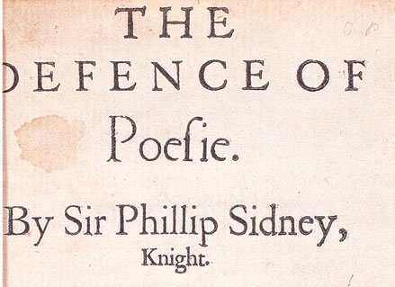
The long s is an s and never was and never will be an f. If you look closely, you’ll see that in most typefaces, this mysterious character has a shorter line through its vertical that only exists on its left side. This bisector does not go all the way through, as seen with a proper f; it just hangs demurely to the left. Who is this strange letter, and how are we supposed to read it?
The long s comes from handwriting, and was in use in ancient times, the dark ages, the middle ages, the renaissance, long before the invention of printing. Its use in the type cases of western printers continued uninterrupted in Europe and the colonial world from Gutenberg through to the end of the eighteenth century. It is prominently on display in the Declaration of Independence, the Bill of Rights, and all of America’s fundamental documents, but it is still a source of confusion for modern readers.
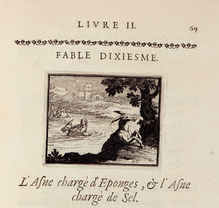
The long s is formed as a natural appendage to its neighbor letters. It either grows from the top of the preceding letter and flows down, (think of cursive handwriting, as when an s follows an o) or it begins down at the bottom of the line, and reaches up to link to the following letter, as in the case of an s followed by a lower case l, t, or i. Fluidity dictates handwriting. It’s important to keep in mind the physical limitations and parameters of a Medieval scribe’s hardware: parchment and quill pen. They would have penned thousands of words by hand over a somewhat rough and varying surface with a feather. The letters pour out in continuous lines, efficiency and practice favoring linking letter forms.
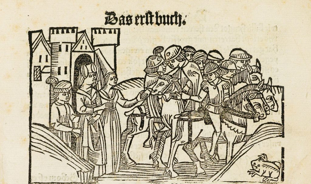
Reysen und Wanderschaffen durch das Gelobte Land, attributed to Jean de Mandeville, Strassburg, 1488. Sold October 2018 for $106,250.
Mechanizing Handwriting
Before Gutenberg, nothing other than handwriting existed. We live in a post-print culture, so this is hard to grasp. Type, typewriters, the alphabet, we take them all for granted. We feel that when we write, we’re pulling from the alphabet, but really, the alphabet was pulled from handwriting. We’re like the fish who don’t know about the water. I remember that moment in elementary school when someone pointed out that we were surrounded by air, and not “nothing” (my contention).
So, how to take apart the stream of writing, a series of letters, contractions, and punctuation always strung together in continuous strands? Before solving the technical challenges of cutting punches and casting types, the earliest printer first needed to break the flow of the handwritten word into individual characters, to conceptualize and demarcate modular units that could be combined and recombined to create every word, letter, and phrase in the Old and New Testaments of the Bible.
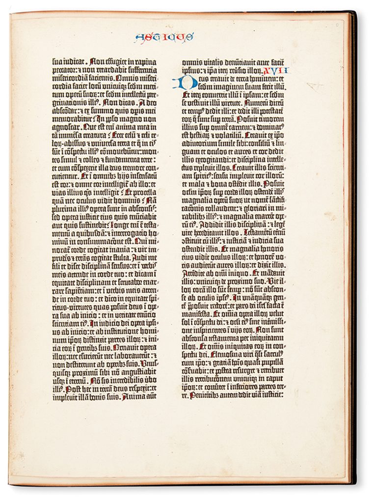
Gutenberg’s better way was nothing less than a digitization of handwriting and arguably the invention of the modern alphabet. For every book printed with movable type, every letter, accent, piece of punctuation, diacritical mark, accent, contraction, every space between letters, all the space between lines, in short, everything we see and everything we don’t see, all are physical objects. We still refer to the spacing between lines as leading, for the lead strips that sit between each line of type.
Scholars who have studied the Gutenberg Bible have derived that he used approximately 290 different characters. Take a look at the image below. Notice the connected letters, diacritical marks, punctuation, and the last word in the last line: famosissim. No information survives on Gutenberg and his collaborators’ process. Our only evidence is the books they have left us, and from these we can at least infer that they were emulating handwriting. Moreover, nothing other than words written by hand existed in Western Europe at this time.
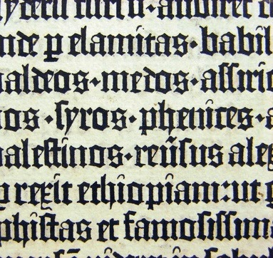
So, back to the long s in its natural habitat. Where can we find our elusive prey? In short, everywhere: it is used after an o, an a, before a hyphen, before the letters k, and b, at the beginning of a word when a round letter is coming next, before t, before i—everywhere!
Ligatures Abound
The long s is an obvious entry point, but many other typographical ligatures, other holdovers from the days of handwritten text, persist, including the turned r, fi, fl, æ, œ, ss, st, sh, 🙰… the list is as long as the type designer would like*. The elegance of joined letters as derived from the natural liquidity of writing inspired the great Venetian italic types of the fifteenth and sixteenth centuries, and continues to inform typography today.
*Editor’s Note: We included the ligatures that were readily available online for this story.
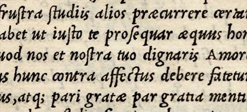
Here’s a great sample of italic type used by master printer and scholar Aldus Manutius in 1505. Note the st, ct, un, is, æ, and other ligatures.
Early printed books are a portal to our shared intellectual and artistic history. Arts of the book encompass a variety of crafts that combine to produce these irreplaceable artifacts. As the role of objects shifts in the twenty-first century, the physical book continues to call. And with it, so does the ſ.
