Le Corbusier’s Color Theory Sample Book
Before the holidays drive you up a wall, let an unusual piece in our December 1, 2016 sale of Art, Press & Illustrated Books soothe you with harmonious colors.
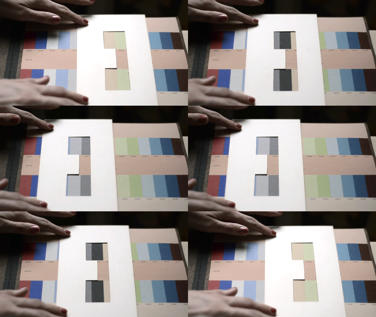
Famed architect, designer and artist Le Corbusier believed that color could change a person’s perception of space. In the 1920s he began to develop a logically structured system for color design based on his principles of “color concepts.” He created what he called a “color keyboard” which he thought would inspire people to select matching and harmonious colors for interiors. He assigned specific “functions” to colors (weight, depth perception, unity, psychological effects, etc.) and specific groups of colors were assigned to each of those functions. The wallpaper collection here, commissioned by Salubra, included monochrome and patterned colors that, to him, fulfilled all of these functions. A paper “keyhole” included in the book was a masking tool to help determine these combinations.
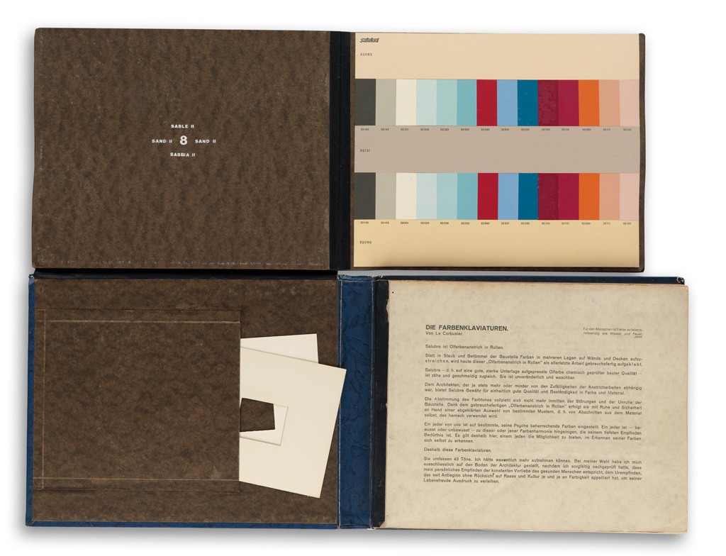
Sold for $6,000.
The KT Color Company explains the folio thusly:
“The small samples showed colors for all of the functions, allowing for functional differences and personal preferences in color selection. Radiators could be hidden, windows framed, dominant walls placed, contrasts heightened, and compositions completed using the range of colors provided. The limited selection would, however, prevent excesses.”
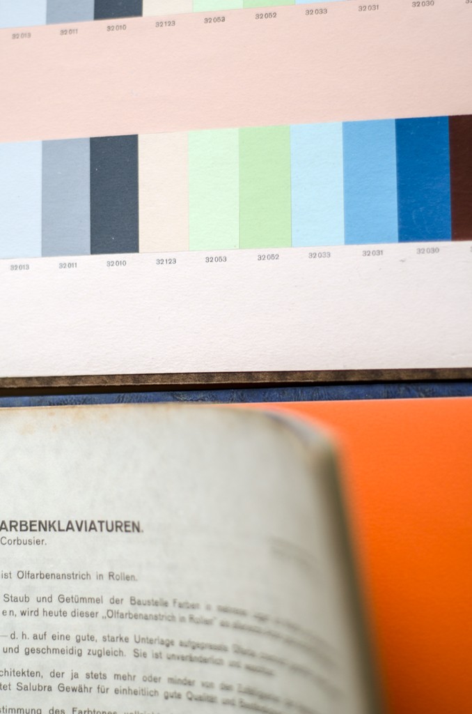
Le Corbusier divided colors into three categories:
- Constructive: natural pigments to create pleasing atmospheres and to alter the perception of space
- Dynamic: synthetic pigments to create highly contrasting, more emotional effects
- Transitional: transparent, synthetic pigments to alter surfaces without affecting the perception of volume
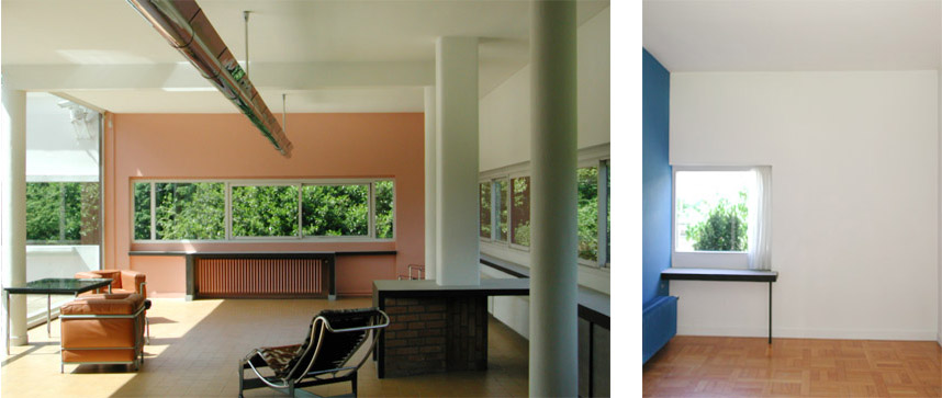
In looking at Le Corbusier’s architecture, it is possible to see that he indeed adhered to these principles. “Light” colors—more commonly “warm colors”—are used on walls in direct sunlight, while “shadow” colors—blues, grays and “cool” colors—are used on walls in full or partial shadow.
Printed throughout the introductory texts is Fernand Leger’s motto: “For man, color is as vital as water and fire.”
Fernand Leger’s motto, printed throughout the introductory texts.


![Grace Meschery-McCormack shares about two copies of Fernando de Rojas’s ‘La Célestine,’ including a limited edition copy illustrated by Pablo Picasso.
At auction April 22. Learn more about the works at the link in our bio.
#Rarebooks #rarebookdealer #antiquarianbooks #auctions
_______________________________________
Music Credit:
Schubert - Piano Quintet in A major ‘The Trout’, D. 667 - IV. Andantino – Allegretto
Music provided by Classical Music Copyright Free on Youtube [https://tinyurl.com/visit-cmcf]
Watch: • Schubert - Piano Quintet in A major ‘...]](https://scontent-iad3-1.cdninstagram.com/v/t51.75761-15/491443494_18499096345036585_5935932878956098058_n.jpg?stp=dst-jpg_e35_tt6&_nc_cat=107&ccb=7-5&_nc_sid=18de74&_nc_ohc=ostXVtDDbb4Q7kNvwHZ-361&_nc_oc=AdkTFTlWxAJeofFczbA8cqnIGv7iN7enlz_0FCOhihr51VzfEZ7vUkMWgZUhTaQVla0&_nc_zt=23&_nc_ht=scontent-iad3-1.cdninstagram.com&edm=AM6HXa8EAAAA&_nc_gid=NSkBJ9xiQxIfYzkaPP8d2Q&oh=00_AfFuixbbXIKagrFBdLyMxdDPR9KwIyrmDMUKYJ84T1NK7g&oe=6818EC91)


