Artist Profile: Edward Penfield
Edward Penfield, the Father of the American Poster
“A poster should tell its story at once—a design that needs study is not a poster, no matter how well it is executed. We are a bit tired of the very serious nowadays, and a little frivolity is refreshing.”
Edward Penfield
Edward Penfield was born in Brooklyn in 1866 and studied at New York’s influential Arts Student League. When he first began practicing his poster craft the American artists working in the genre were slim and the art form itself was unsophisticated when compared to his European counterparts such as Alphonse Mucha and Toulouse-Lautrec. In 1890 the Grolier Club in New York City held the country’s first exhibition of posters; of the 100 items in the exhibition, only seven were by American artists.
Penfield would go on to become the first American poster designer of note and his work quickly became recognized and appreciated around the world. Summing up his own graphic philosophy, Penfield wrote in the introduction to the 1896 book, Posters in Miniature: “a poster should tell its story at once—a design that needs study is not a poster, no matter how well it is executed. We are a bit tired of the very serious nowadays, and a little frivolity is refreshing.”
He began working for Harper’s Magazine as an illustrator in 1891 when he was only 24 and rapidly became the company’s art director, which he held from 1893 until he retired from the magazine in 1900. During this era, he created what has become his most important artistic legacy: a series of 75 monthly posters designed for the magazine spanning the period from April 1893 through August 1899. It is interesting to note, however, that this enduring series represents“less than a third of his thirty-four-year career. During the decade after his self-retirement from Harper and Brothers, his freelance work was seen by millions of people on hundreds of magazine covers and advertisements.
His prolific output, combined with his prodigious talent, justifiably earn him the sobriquet “Father of the American Poster.”
“The composition of Mr. Penfield’s posters was utterly and entirely original . . . his startling, unbalanced compositions, his infallible sense of suggesting large ideas on a small sheet of paper, and his massive, clearly drawn letters were his own.”
Charles Matlack Price
Below Nicholas D. Lowry takes a look at the posters Penfield created for each of his seven years working for Harper’s. The evolution of his style during that time takes a circular route going from charming illustration to bolder, flat-formed representation to a hybrid of the two styles. Throughout the years one can sense the influence of the floating world of Japanese ukiyo-e woodblock prints, as a number of Penfield’s posters feature little or no background detail whatsoever. One can also see similarities to the work of Theophile-Alexandre Steinlen and Henri de Toulouse Lautrec to whom Penfield’s work can and has been favorably compared.
1893: Edward Penfield’s First Poster
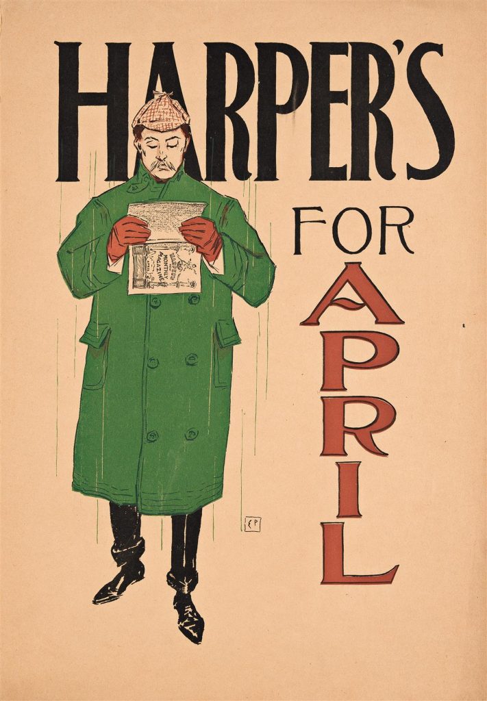
Penfield’s earliest posters for Harper’s “clearly illustrated his understanding of an effective poster, its simplicity and good composition, which he coupled with subtle humor most often expressed by visual references to the proverbial qualities of the seasons and by quiet comments on the lifestyles of the more leisured classes of American society” (Kiehl p. 13). In 1894, other magazines and journals jumped on the poster bandwagon, both fueled by and igniting the poster craze, but through 1893, Penfield’s posters were virtually the only ones available for public consumption.
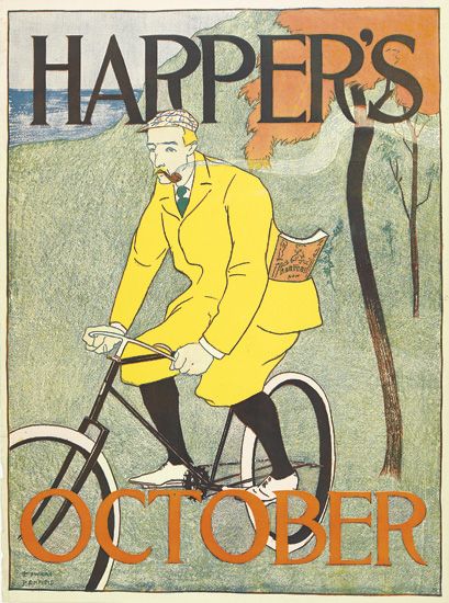
“In April 1893 something new was spotted in the shops of American news vendors and booksellers. Amid the handbills and letterpress notices of topical interest, there was a small poster . . . this was unprecedented . . . The poster was bold in its simplicity: the singular, isolated figure of the man; the magazine; a mere suggestion of the weather proverbially associated with the month; and bold lettering carefully integratedy into the design.” (Kiehl p. 11).
This first poster was well received by the public — and by critics alike. “It was unlike anything seen in the land before. It was a poster which forced itself upon one: in design and colur it was striking, and yet it was supremely simple throughout…” reported Herbert Stone in The Chap-Book. “The poster was distinctly successful; it was theoretically as well as practically good. The artist had attained his ends by the suppression of details: there were no un-necessary lines.”
Curiously, this handsomely-clad pedestrian is holding the magazine horizontally, clearly looking at one of the illustrations, not reading an article. As an artist whose first illustration appeared in Harper’s in 1891 it is likely that Penfield here is giving a silent shout-out to the talent of his fellow artists, whose work clearly captivated the readers as much as the stories did.
“Penfield was probably the first American artist to realize the possibilities of an aesthetic and unified design in posters . . . his stylized, uncluttered illustrations, which clearly draw their inspiration from the Japanese print, were inventively executed . . . [and] reveal a fundamental understanding of the psychology of effective publicity in their presentation of the escapist, the select and the elegant.” (Keay p. 8).
1894-1895: A More Sophisticated & Graphic Style
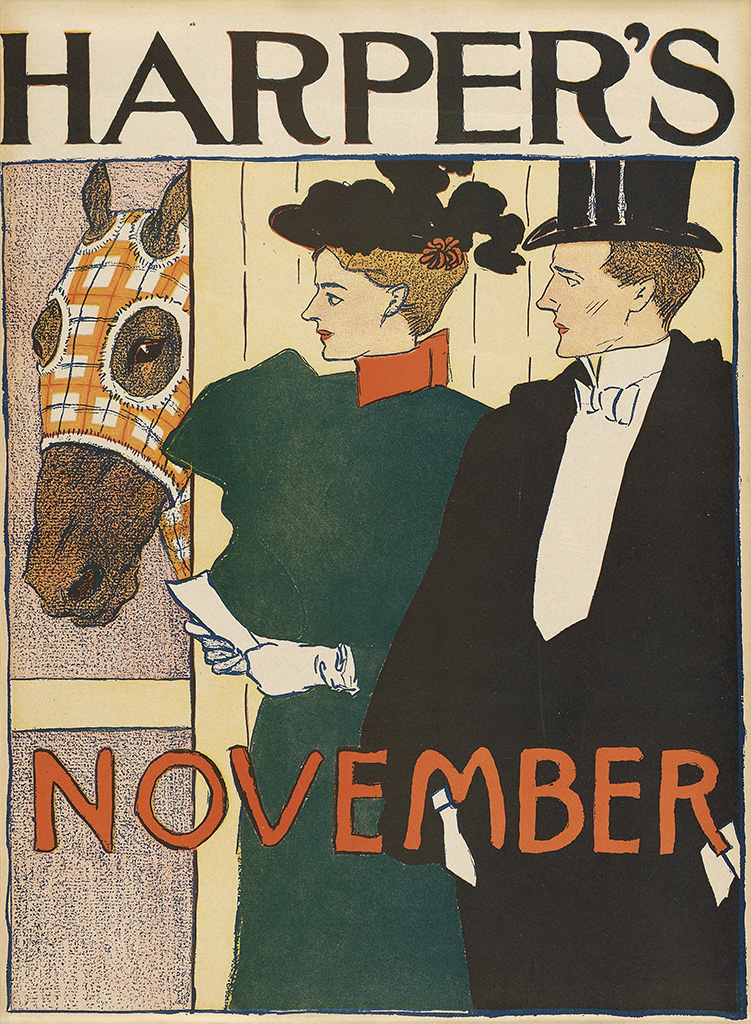
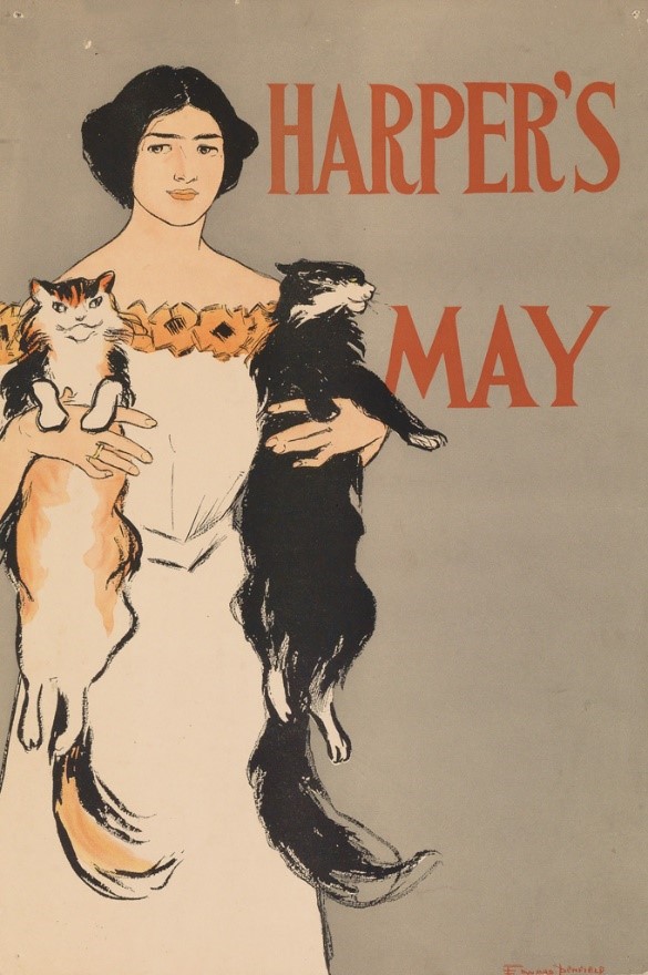
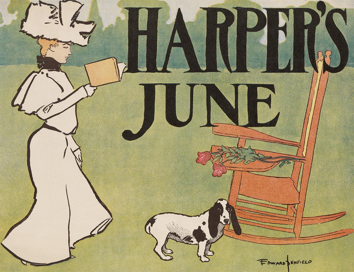
By the end of his second year creating posters for Harper’s, Penfield’s style grew more sophisticated and graphic, presenting us with simpler images that convey a more complex story.
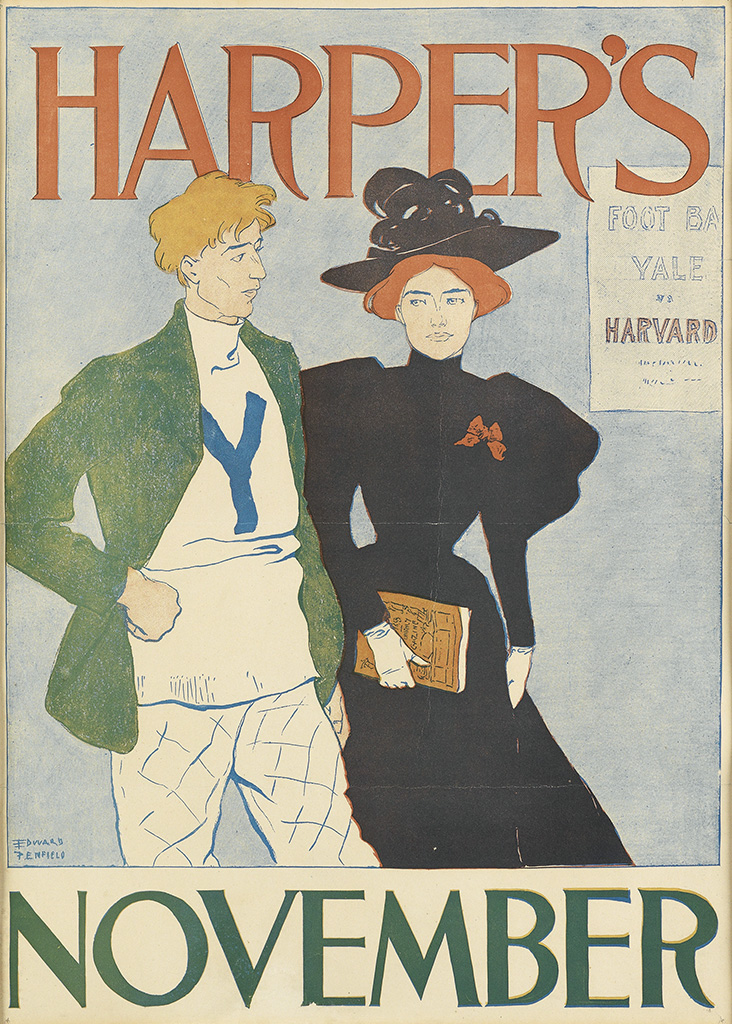
Seen Above: the image for the October 1894 issue is one of the earliest American posters to feature a bicycle. Also from 1894 is the November issue which was one of the earliest American football posters; the first Harvard vs. Yale football game (a rivalry that is simply referred to as “The Game,”) was played in 1875, and more closely resembled rugby than football as we now know it. In 1894, Yale beat Harvard 12-4.
“Mr. Penfield has always combined a certain Parisian chic with a London poise of aristocracy and refinement blended the two by some curious psychological sleight of hand into an expression of the best that is America.” (Charles Matlack Price, Posters, 1913, p. 150)
“They are all so eminently self-sufficient—with a poise of their own and a gracious self-assurance, like well-balanced people, never obtrusive, but ever prepared to take their part in whatever surrounding their fortunes may place them” (ibid p. 235).
1896: The Height of Edward Penfield’s Craft
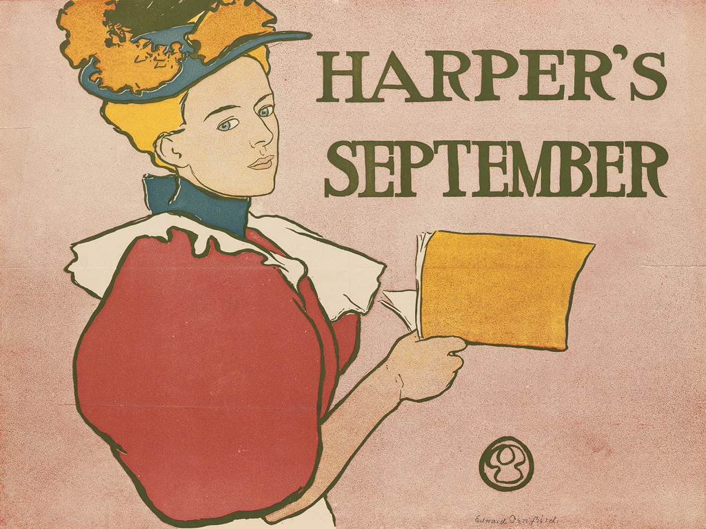
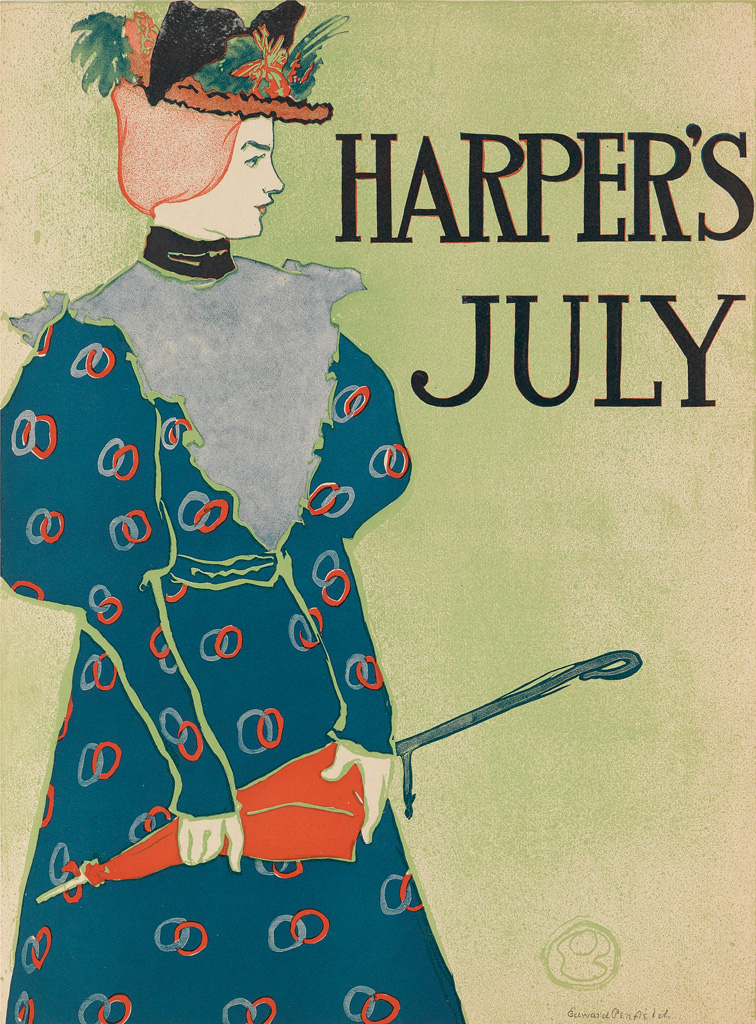
By 1896, Penfield had reached the height of his craft, refining his lines, compositions and color schemes to a level of unsurpassed agility. “By 1895-96, his figures’ clothing had most often been flattened out to abstracted shapes, and backgrounds had been freed of detail, sometimes even eliminated totally for an overall area of color.” (Designed to Persuade p. 10).
“Mr. Penfield has always combined a certain Parisian chic with a London poise of aristocracy and refinement blended the two by some curious psychological sleight of hand into an expression of the best that is America” (Charles Matlack Price, Posters, 1913, p.150).
Charles Hiatt captures the essence of Penfield’s ladies in Picture Posters, his 1895 tome, where he explains, “[Penfield’s] maidens are adorably conscious of their power to charm, and are fully alive to the fact that their gowns are of the smartest.” (p. 288).
“Surely, this is personality - these posters have actual character.” (Charles Matlack Price, Posters, 1913, p. 235).
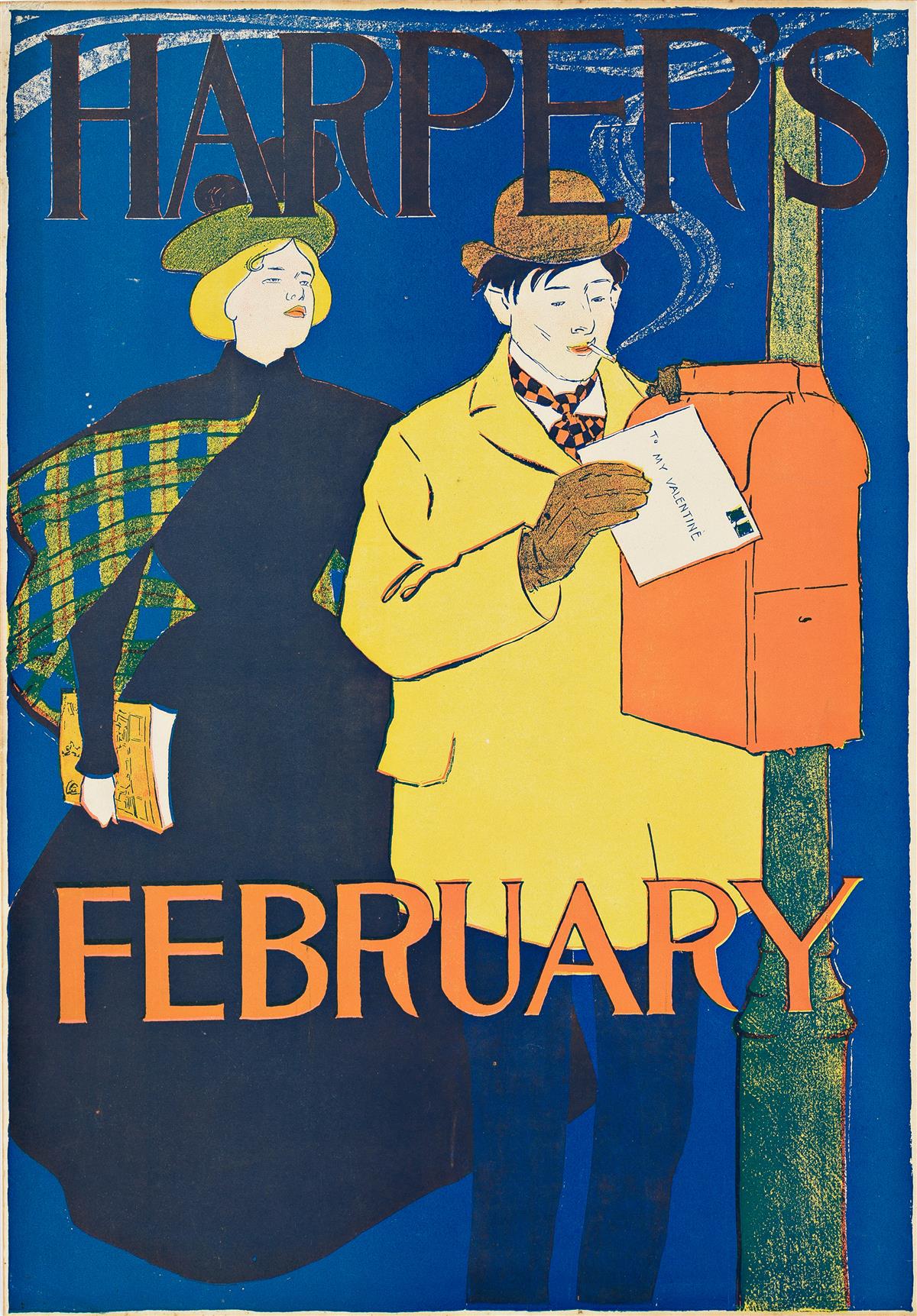
“The type of ideal young woman he created is first cousin to the Gibson Girl. Unmistakably upper class, aloof, and slightly bored, she is shown either alone or with her equally well-bred male companion indulging in whatever leisure-time activities the season demanded.” (The American Poster p. 11)
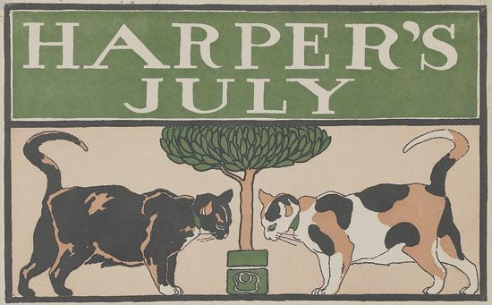
Seen Above: Kiehl, and others, contend that the March 2897 image was adapted from a four-panel screen designed by Pierre Bonnard. Although not printed until 1899, Bonnard’s work, La Promenade des nourrices frise de fiacres was painted in 1894. Beginning in April 1896, Penfield began to use a bull’s-head monogram instead of his signature, much the same way as James Whistler used a butterfly logo and the seal on Japanese woodblock prints. In the above example Penfield incorporates his logo into the image by including it in the base of the flowerpot.
