Interview with Rick Meyerowitz: “A Literate, Civilized & Mature Fellow”
Artist and illustrator Rick Meyerowitz was kind enough to talk to us in advance of our June 5 sale of Illustration Art, which will include highlights from his personal collection, coming to auction for the first time.

Joel Meyerowitz, Rick Meyerowitz.
Interview with Rick Meyerowitz
How and when did you decide to pursue art and, specifically, illustration?
My parents, who were fabulists (they made up fables) and confabulists (they made up confusing fables), often said that when I was five years old I announced to my family that I was going to be an artist so I could draw pictures for books, just like the artists whose work I loved in the books I loved. It turned out that forging a life as an illustrator was a bit more complicated than just saying it. But who knew? I was five.
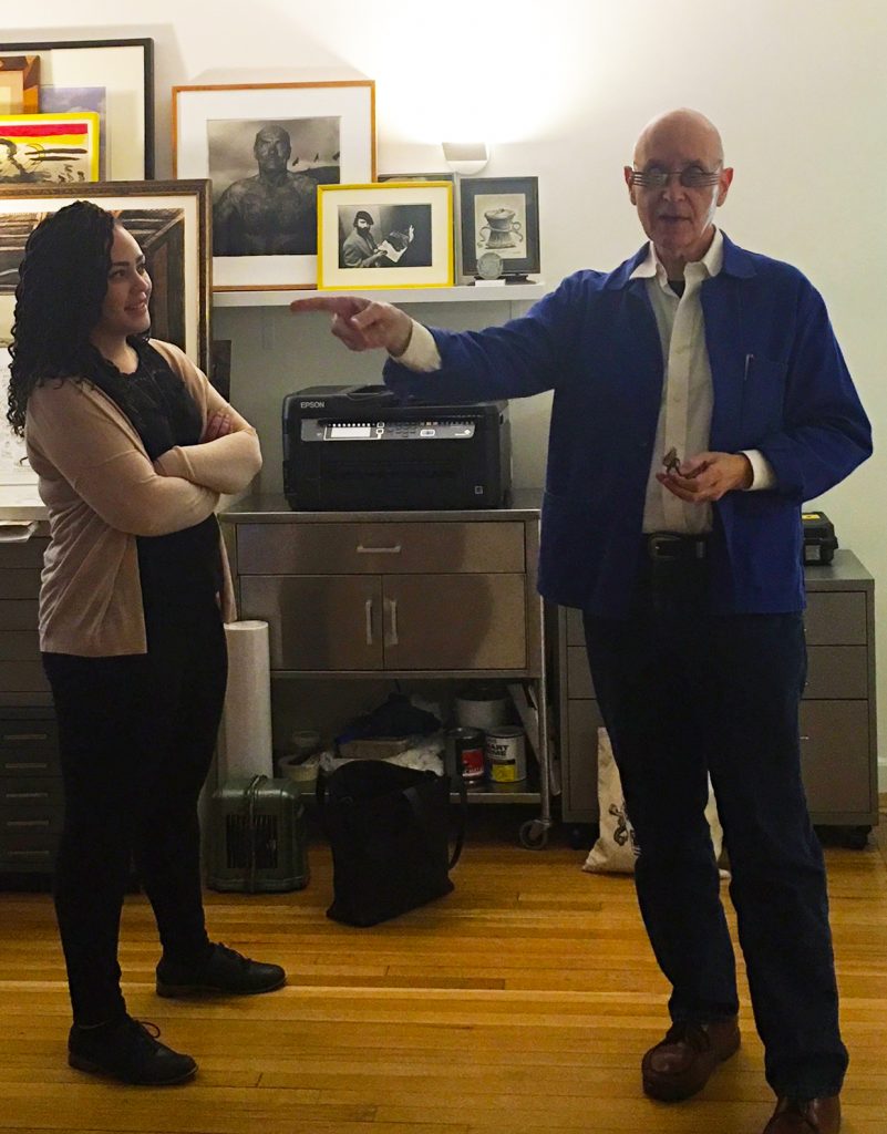
Junior Specialist Arielle Bremby with Meyerowitz in his studio.
Meyerowitz wears fork glasses.
What was your first published artwork?
In 1967 I called on Ken Deardoff, the art director of Evergreen Review, which was published by Grove Press. He liked my portfolio and commissioned a full page illustration–a rarity, I think, for a first showing of a portfolio. He also bought a piece right out of my portfolio for immediate use in the magazine. It was a gag cartoon that showed LBJ on a couch in the Oval Office in… well, in flagrante delicto with Minnie Mouse. Not a pretty picture, not to mention some serious female rodent abuse. Mickey—at the door of the Oval Office, catching them in the act—is crying out “MINNIE!” I comfort myself with the fact that it could’ve been worse, although I’m not sure how.
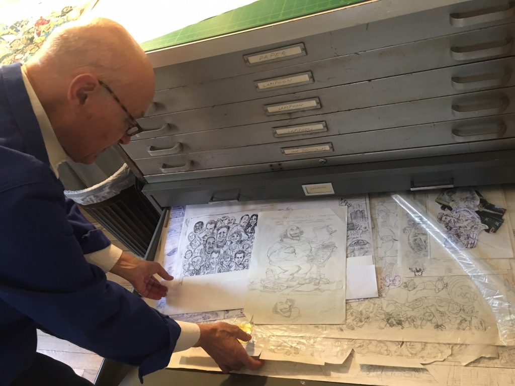
Meyerowitz in his studio, looking at sketches marked Lampoon. Meyerowitz wears regular glasses.
Which publication did you enjoy working for the most, and why?
The answer has to be The National Lampoon, for which I contributed more than 700 drawings from the first issue in April 1970 until almost the last issue in January 1991. What do I want to tell you about the unbridled freedom and exhilaration of being the visual face of the magazine during its heyday and beyond? It was epic.
(Note: For a full picture of those days, see Drunk Stoned Brilliant Dead: The Writers and Artists Who Made The National Lampoon Insanely Great.)
Meyerowitz surveys his domain.
Can you describe your process?
I draw and paint and write. I am a literate, civilized and mature fellow, but in my work I can be rather incorrigible. My sense of humor leans toward wicked. It’s outré, with a side of id. But where else can a satirical artist be satirical these days if not in the corral of his own imagination, and the privacy of his own artwork. That said, my work is always made to be seen, and how private can it be if it appears in a magazine or at auction?
How many preliminary sketches (like some of the works in this sale) do you usually create for a work?
The concept comes quickly. The details take longer. There’s no standard number of sketches. I work till I get it right and make myself laugh.
How important is humor in your drawings, visually and conceptually? And how do you strike that balance?
I’m serious about my work, but I’m a humorous illustrator. The idea and the way I put the idea down on paper are inherently balanced toward humor. I don’t know how to do it any other way.
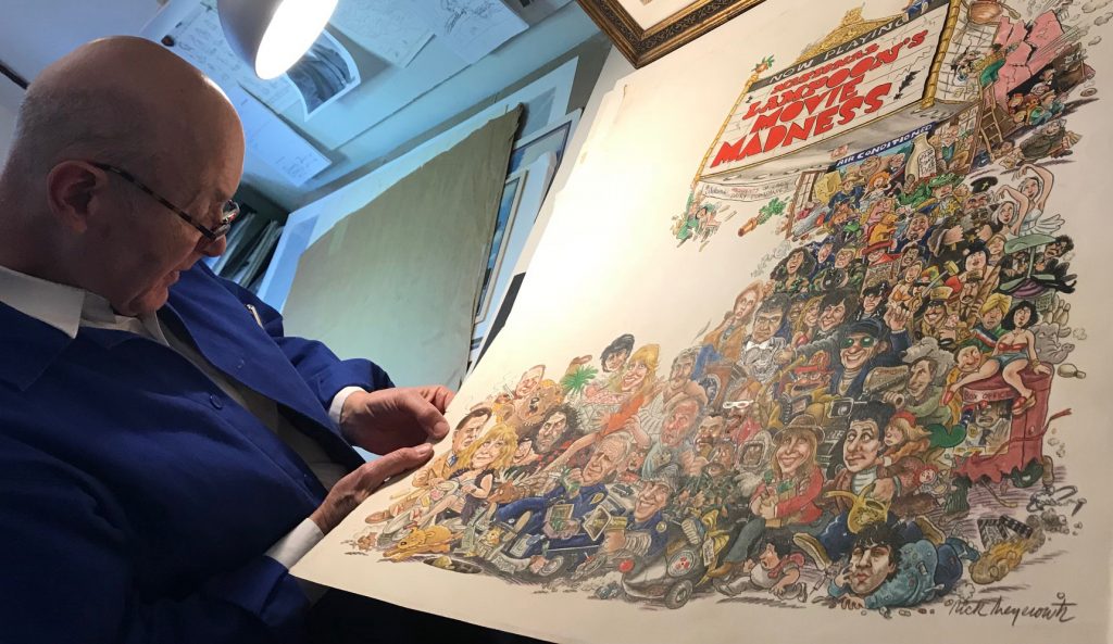
Meyerowitz in his studio.
Among your personal collection and archive, are there any works with which you are unwilling to part?
There are works I’m quite fond of, and they are not necessarily my most well-known pieces. As for my willingness to part with them, well, maybe once I wanted to hang onto some works, but not any longer.
Which project do you remember most fondly? Of which are you most proud?
I could tell you about many different projects that are the ones I remember most fondly. Here are two: New Yorkistan, my first collaboration with Maira Kalman, because of the heady energy of finding she and I worked together beautifully, and because of the speed with which we produced that idea and image out of nothing, in that gloomy atmosphere following 9/11. And because of its unexpected and almost explosive impact on the culture.
New Yorkistan was good, but I’ll tell you, my daughter Molly was born in March, 1978, the same week the poster art for Animal House was due. Her mother and I collaborated on her birth all that week. I worked on the Animal House art for six days before and after her birth. I don’t remember sleeping that week (or for the rest of that year). In all the years before or since, I’ve never had another week like that. Fond, proud and memorable hardly describe it.
Meyerowitz being interviewed.
About the Collection
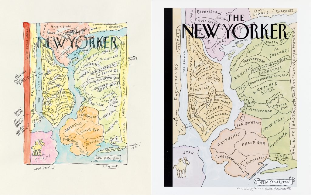
Lot 249: Rick Meyerowitz & Maira Kalman, New Yorkistan, watercolor and ink, a final sketch for a cover for The New Yorker, 2001. Estimate $10,000 to $15,000.
The auction features some of Meyerowitz’s most recognizable work, including a final watercolor sketch for one of the best-selling New Yorker covers, New Yorkistan, which appeared on the December 10, 2001 edition of the magazine. It was the acknowledged first comic relief for the city after September 11, 2001. Posters of the cover sold out within days of its release, and it was listed as #14 on the American Society of Magazine Editors’ list of top covers in the last 40 years. Writer and critic Sarah Boxer remarked that it stood as the successor to Saul Steinberg’s unforgettable View of the World from 9th Avenue. By “Afghanistanizing” the various neighborhoods of New York City in an amalgam of Yiddish, Persian and vernacular slang, every local could laugh and identify with New Yorkistan, bond over it, and realize that they, too, were “made up of tribes with a bunch of exotic names that mean nothing to outsiders,” as she wrote in The New York Times.
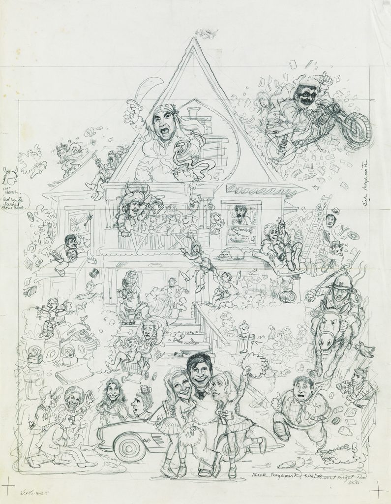
Lot 172: Rick Meyerowitz, Animal House, graphite, sketch for film of the same name, 1978. Estimate $3,000 to $4,000.
Meyerowitz rose to prominence in the 1970s as a cartoonist for National Lampoon and with such iconic pieces as the promotional poster for Animal House. The work perfectly captured the chaos of the film. In his 2010 book Drunk Stoned Brilliant Dead, Meyerowitz recalled: “[After the premiere screening] John [Belushi] and I stopped in the lobby in front of a huge reproduction of the poster. We were both staring holes in it. I was thinking I was a lucky guy; I’d managed, somehow, to capture the whole damn movie in one piece of art. . . John, as if reading my thoughts, said to me, ‘You nailed it, man. You really fucking nailed it.’ It is the best compliment I have ever received about my work on Animal House.”
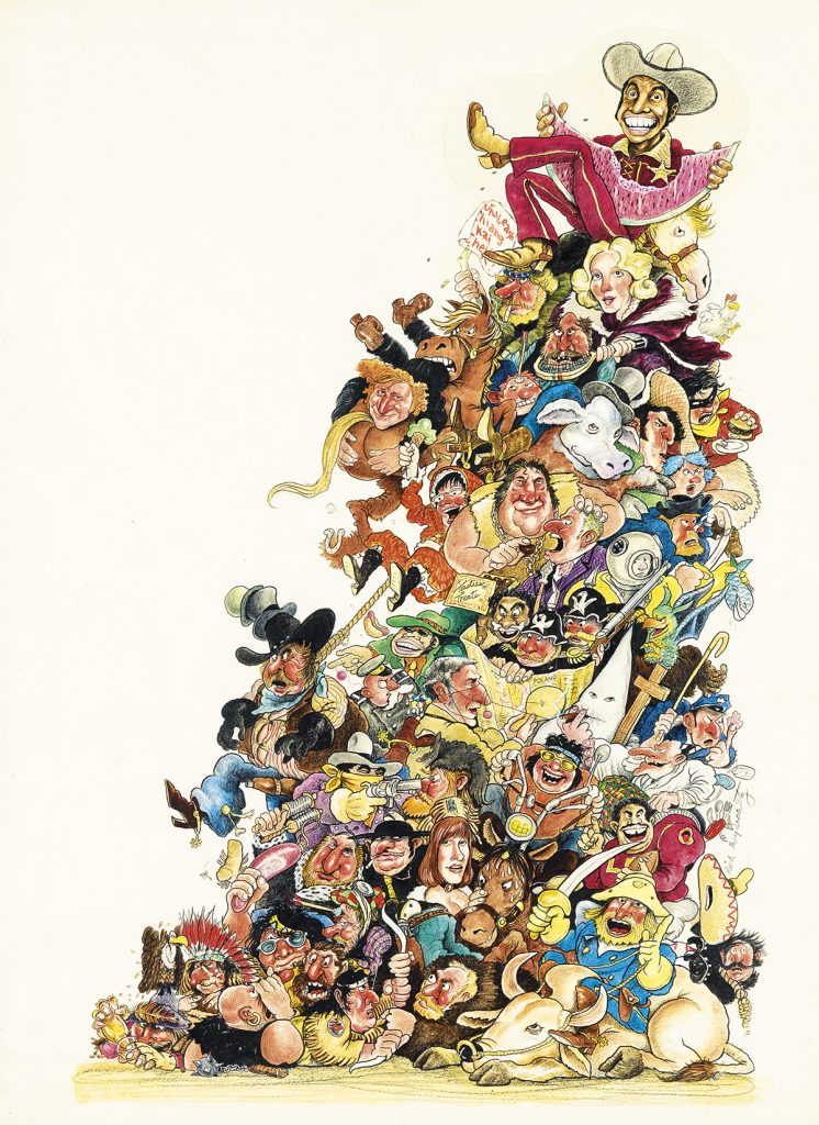
Lot 173: Rick Meyerowitz, Blazing Saddles, watercolor, colored pencil and gouache, international promotional poster for Blazing Saddles, 1974.
Estimate $4,000 to $6,000.
The Animal House poster perfects the style Meyerowitz popularized for the international promotion of Blazing Saddles in 1974. Meyerowitz said of the project: “Murray Smith asked me to work on Black Bart, the next Mel Brooks film after The Producers. He suggested that we really knock [the studio] out by doing something impressive for our first presentation, so I created this very large and detailed color painting. It’s not the final art, but it is much more detailed than any sketch I’ve ever done. The studio loved it and so did Mel. They changed the title of the film but that didn’t affect the art, and after I completed the final poster art, everyone seemed deliriously pleased. I even got a phone call from Mel, who began our conversation with ‘Meyerowitz? Jewish, right?'”
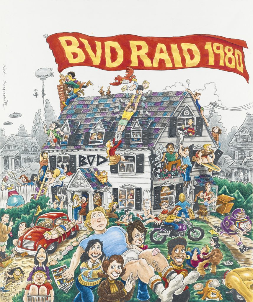
Lot 18: Rick Meyerowitz, BVD Raid 1980, watercolor and colored pencil, advertisement for BVD: The Great American Underwear Company, 1980. Estimate $1,500 to $2,500.
Inspired by the success of the Animal House poster, Meyerowitz was commissioned in 1980 to create an advertisement in the same spirit for BVD: The Great American Underwear Company. The resulting BVD Raid 1980 riffs on the raucous scene of a collegiate fraternity house and the idea of a “panty raid” in which co-eds steal the brothers wearing the eponymous underpants.
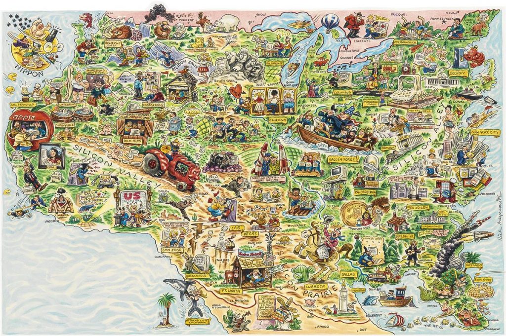
Lot 207: Rick Meyerowitz, Digitial Deli Map of Personal Computer America, watercolor and colored pencil with collage, for Workman Publishing Company, 1984. Estimate $3,500 to $5,000.
New Yorkistan was not Meyerowitz’s first satirical map. In a 1984 commission for Workman Publishing Company’s book, Digital Deli: The Comprehensive, User-Lovable Menu of Computer Lore, Culture, Lifestyles and Fancy by The Lunch Group, Meyerowitz reimagined North America as a cornucopia of personal computer users rife with visual gags including the world’s largest cheese computer; the Homebrew Computer Club in Palo Alto; Dr. John Lilly communicating with dolphins via Apple II computer; a lighthouse monument to the first microchip; and two hikers in the Pacific Northwest region, one of whom is carrying a personal computer on his back with the screen displaying “You are lost.”
Browse the full catalogue.
